Explore advanced techniques in visualization using Seaborn to elevate your visual storytelling. Enhance your data presentation with sophisticated graphics.
Seaborn is an advanced data visualization library in Python, built on the foundations of Matplotlib.
It was specifically designed to improve the ease of creating informative and aesthetically pleasing visualizations, catering to the unique needs of statisticians and data scientists. By abstracting many of the more complex aspects of Matplotlib, Seaborn allows users to generate visually compelling graphics that effectively communicate their data story with minimal coding effort.
In the realm of data storytelling, visualization plays a crucial role. While raw data often contains the necessary information, it can be challenging to interpret and extract meaningful insights without proper visual representation. This is where Seaborn comes into play. It empowers users to not only visualize data interactions but also to provide context to the numbers. The library offers a range of high-level interfaces for drawing attractive statistical graphics, integrating various data types and allowing for a comprehensive exploration of relationships among variables.
One of the significant advantages of using Seaborn is its ability to create advanced visualizations such as heatmaps, violin plots, and pair plots that reveal intricate patterns within the data. These visual forms enhance storytelling by showcasing insights that may be hidden in traditional tabular data presentations. Moreover, Seaborn adheres to a design philosophy focused on minimizing the need for extensive customization while still delivering compelling graphics. Features like built-in themes, color palettes, and a variety of plot types enable practitioners to elevate their analyses and communicate findings effectively.
Ultimately, Seaborn serves as a pivotal tool in contemporary data visualization, facilitating deeper engagement with datasets and enriching the narrative that emerges from analytical efforts. Its insistence on clarity and elegance in graphical representation makes it an essential library for anyone looking to enhance their visual storytelling capabilities.
To begin utilizing Seaborn for your data visualization needs, it is essential to first install the library along with its dependencies. Seaborn is built on top of Matplotlib and works seamlessly with Pandas, which means that having these libraries in your Python environment is imperative. To install Seaborn, you can use pip, a package manager for Python. Open your command line or terminal and execute the following command:
pip install seaborn
This command will install Seaborn alongside its necessary dependencies, including Matplotlib and Pandas. If you already have these libraries installed, you can easily update them to ensure compatibility with the latest version of Seaborn by using:
pip install --upgrade seaborn
After successful installation, it is advisable to verify that the installation went smoothly by importing Seaborn in your Python environment. You can do this by executing the following lines in your Python interpreter:
import seaborn as sns
import matplotlib.pyplot as plt
import pandas as pd
If you do not encounter any errors, you are ready to start creating visualizations. Understanding the basic concepts of Seaborn is crucial for effective usage. Seaborn primarily works with DataFrames in Pandas, and it utilizes datasets formatted in tabular forms, where rows typically represent observations and columns represent variables. The library offers numerous functions such as sns.scatterplot(), sns.lineplot(), and sns.barplot(), which are specifically designed to facilitate complex visualizations with minimal code.
Through its functions, Seaborn allows for great flexibility and customization of plots by providing options for aesthetics and various visual elements. Familiarizing yourself with these basic concepts will greatly enhance your ability to craft insightful visual stories from your data. Once you have a solid grasp of this foundation, you will be well-equipped to explore more advanced visualization topics using Seaborn.
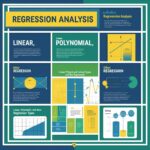
Seaborn, a powerful Python data visualization library, offers a variety of visualization types that can illuminate distinct facets of data. Understanding these visualizations is crucial for effective data storytelling. Common plot types include scatter plots, line plots, box plots, and heatmaps, each serving unique purposes in data analysis.
Scatter plots are ideal for showcasing relationships between two continuous variables. By marking data points on a Cartesian plane, they enable analysts to identify trends, clusters, or outliers. However, while scatter plots are intuitive, they may become cluttered with large datasets, drawing attention away from key insights.
Line plots, on the other hand, are particularly useful for illustrating trends over time. They connect individual data points with lines, effectively displaying changes and patterns across sequential data. Line plots work well for time series data but may not convey accurate trends effectively if the underlying data changes drastically.
Box plots are instrumental in illustrating distributions across categories, revealing information about medians, quartiles, and potential outliers. One of their advantages is the ability to compare multiple groups side by side. Despite their effectiveness, box plots can sometimes obscure raw data insights, leading to loss of nuanced information.
Heatmaps serve as a visual representation of data through color gradients, particularly valuable for correlations between variables in larger datasets. They provide an efficient method to visualize complex data matrices, but careful attention must be given to color selection to ensure accurate interpretation of the underlying values.
The choice of visualization type can significantly impact how data is interpreted. Selecting the appropriate plot depends on the specific story one wishes to convey and the nature of the dataset. Leveraging Seaborn’s comprehensive suite of visualizations can greatly enhance how analysts and audiences engage with data.
Customizing visualizations is a critical aspect of data presentation, particularly when utilizing a powerful library like Seaborn. Tailoring your visualizations not only enhances their aesthetic appeal but also improves their effectiveness in conveying information. One of the first steps in customization is adjusting the color palette. Seaborn offers a variety of built-in palettes, such as “deep,” “pastel,” and “dark,” which can be employed to create a specific mood or highlight particular data points. Selecting the right color scheme is essential; it should not only be visually appealing but also help in differentiating groups within your data.
Furthermore, modifying plot styles can significantly impact the readability of visualizations. Seaborn provides several style settings that allow users to toggle between different themes, such as “whitegrid,” “darkgrid,” or “ticks.” These themes can enhance the clarity of charts by adding subtle backgrounds or grid lines, making it easier for the audience to interpret data without distractions. Applying a consistent style across all visualizations in a single project can also contribute to a cohesive narrative, strengthening the overall visual storytelling.
Another fundamental aspect of customization is enhancing the axes. Customizing axis labels, title fonts, and tick marks can facilitate understanding and engage viewers. Utilize descriptive titles and clear labeling to provide context for your visualizations, thereby guiding the audience in interpreting the information accurately. Adjusting the scale of the axes, such as applying logarithmic scales for skewed data, can also enhance the effect of the visualization.
Actionable tips for choosing themes and color combinations include examining color theory principles and considering color-blind friendly palettes to ensure inclusivity. Gathering feedback from peers can further inform effective adjustments. By thoughtfully applying these customization techniques, you will be well on your way to creating compelling, informative visualizations that resonate with your audience.
Utilizing advanced visualization techniques is essential for effectively conveying complex narratives within datasets. One popular approach is faceting, which involves creating a grid of subplots to visualize data across different subsets. This method allows users to categorize data by specific variables, facilitating a more nuanced understanding of the relationships between these variables. For instance, if a dataset includes information about different species and their characteristics, faceting can help display variations in traits across species, making patterns more evident.
An important feature of Seaborn is its ability to generate pair plots, which enable multivariate analysis by showing scatterplots for every possible pair of variables in a dataset. This tool is particularly useful for identifying correlations and interactions among multiple features. By automatically generating a matrix of scatterplots, users can quickly spot trends and outliers, leading to more insightful data interpretations. For example, a pair plot can illustrate the relationship between various measurements of a species, allowing researchers to explore how multiple characteristics interact simultaneously.
Agglomerating data for clarity is another technique that enhances visual storytelling capabilities in Seaborn. By summarizing large data sets through aggregation, such as calculating means or medians, users can distill complex information into more comprehensible insights. When combined with other visual techniques, such as bar charts or line graphs, these aggregated metrics provide a clearer narrative, highlighting overarching trends while minimizing noise in the data.
These techniques—faceting, pair plots, and data aggregation—are powerful additions to any data visualization strategy. By applying them appropriately, users can enhance the clarity and impact of their visual storytelling, allowing for deeper insights and a better understanding of the data at hand.
Seaborn is a powerful visualization library built on top of Matplotlib, offering high-level abstractions that make it easier to create complex visualizations. To fully harness its capabilities, it’s beneficial to integrate Seaborn with other prominent Python libraries such as Pandas, NumPy, and Matplotlib. The integration facilitates seamless data manipulation, statistical analysis, and visualization, enhancing the overall storytelling of your data.
Pandas is widely recognized for its data manipulation capabilities, allowing users to handle large datasets effortlessly. When combined with Seaborn, it streamlines the process of preparing datasets for visualization. For instance, one can utilize Pandas to clean or transform the data, creating a DataFrame that serves as the foundation for generating visualizations. By calling Seaborn’s plotting functions directly on this DataFrame, users can create informative visualizations with minimal code. A simple example includes using the seaborn.scatterplot() function to visualize relationships within a cleaned DataFrame, where data processing in Pandas effectively complements visual analysis.
Similarly, NumPy, known for its numerical computations, offers extensive functionalities that enhance data analysis. It can be employed to generate synthetic datasets or perform computations that facilitate the visual representation of trends. Integrating NumPy arrays with Seaborn allows for a quick and efficient plotting mechanism when dealing with large numerical datasets. This integration aids in producing plots such as line graphs or histograms, which leverage NumPy’s computational capacity for effective data storytelling.
Finally, Matplotlib remains a crucial library when visualizations created in Seaborn require customization. Using Matplotlib functions alongside Seaborn plots enables further refinements and tweaks that enhance the visual output. This interoperability ensures that analysts can tailor their visual narratives to meet specific needs, achieving clarity and coherence in the presentation of complex data. Ultimately, these integrations create a comprehensive workflow that enhances data analysis and storytelling, streamlining processes and elevating the quality of insights derived.

In today’s digital landscape, SEO optimization for visual content has become an essential practice for anyone looking to enhance online visibility. Effective optimization not only improves search rankings but also ensures that visual elements resonate well with the target audience. One critical area of focus is the use of image alt text. This descriptive text serves two primary purposes: it provides context for visually impaired users and helps search engines understand the content of the image. When crafting alt text, be specific and concise, incorporating relevant keywords naturally to elevate your image’s searchability.
Another important aspect of SEO optimization is properly naming image files. Descriptive file names that include pertinent keywords can significantly assist search engines in indexing your visuals correctly. Rather than using generic names such as “image1.jpg”, opt for names like “seaborn-visualization-example.jpg”. This practice not only aids in SEO but also contributes to a more organized media library.
Captions play a vital role in engaging users and providing additional context for images. When writing captions, strive to be informative and incorporate keywords related to the visual content. A well-crafted caption can enhance user understanding and encourage longer viewing times, which are metrics that search engines consider when ranking content. Furthermore, effective sharing of visualizations across social media platforms can dramatically increase engagement. By utilizing visually appealing graphics in posts and encouraging sharing through strategic messaging, you can reach a broader audience and amplify your visual storytelling.
Integrating these SEO optimization strategies into your visual content will not only enhance your overall online presence but will also create a more engaging experience for your audience. As you refine your approach, consider how each element contributes to a cohesive and effective visual narrative.
When creating visualizations with Seaborn or any data visualization library, it is crucial to assess their effectiveness. The primary goal of any visualization is to communicate information clearly and efficiently. To achieve this, various methodologies can be employed to measure aspects such as user engagement and comprehension. These metrics not only indicate how well the visualization communicates its message but also help identify areas for improvement.
One of the most effective methods for evaluating visual content is A/B testing. This technique involves creating two versions of a visualization and presenting them to different segments of your audience. By comparing metrics such as user interaction rates or completion times, you can determine which version resonates better with your viewers. This process allows you to make data-driven decisions that enhance the overall effectiveness of your visuals.
Additionally, gathering feedback from your audience is invaluable. Surveys or interviews can provide insights into how well the audience understands the visualizations and whether they find them engaging. Questions can address aspects such as clarity, aesthetic appeal, and informational value. Analyzing this feedback helps pinpoint specific issues that may hinder comprehension or engagement, allowing for targeted refinements.
Beyond direct feedback, using analytics tools to gather data about user interactions can also offer a wealth of information. Metrics such as the time spent on a page, the number of clicks on specific elements, and social sharing statistics can indicate which visualizations resonate most with the audience. By synthesizing these insights, creators can iterate on their designs to better align with viewer preferences, ultimately enhancing the visual storytelling approach.
In conclusion, testing the effectiveness of visualizations through methods like A/B testing, audience feedback, and analytics plays a crucial role in refining your data storytelling. These practices ensure that your visual content is not only aesthetically pleasing but also effectively communicates the intended message to your audience.
Seaborn has emerged as a proficient tool in the domain of data visualization, enabling professionals across various sectors to transform complex datasets into meaningful visual narratives. The following case studies serve as exemplary illustrations of how effective visualization through Seaborn has significantly impacted decision-making in diverse fields such as business, healthcare, and education.
In the business sector, a leading retail company utilized Seaborn to analyze customer purchasing patterns. By employing heatmaps and bar plots, the organization was able to identify peak purchase times and the most popular products. This visualization allowed them to optimize inventory management and strategize marketing campaigns tailored to customer behavior. The insights gained led to a 20% increase in sales during off-peak hours, demonstrating how effective visual storytelling can drive business growth.
In healthcare, an innovative medical research team used Seaborn to present data on patient outcomes following surgical procedures. By deploying violin plots, they illustrated the distribution of recovery times among different demographics. This visual approach not only aided in better understanding the factors influencing recovery but also facilitated discussions that ultimately led to improved patient care practices. The case highlights how data visualization can influence policy-making and enhance healthcare delivery.
Education has also witnessed the benefits of utilizing Seaborn for visualization. A university applied the library to analyze student performance data across various subjects. By employing scatter plots and regression lines, educators could identify correlations between study habits and grades. This information empowered the faculty to implement targeted interventions, thereby fostering a more supportive learning environment and improving overall student achievement. The case exemplifies the subtle yet profound way visual storytelling can guide educational strategies.
Through these case studies, it becomes evident that the application of Seaborn in data visualization not only enhances understanding but also drives impactful decision-making across various fields. As professionals seek to convey narratives from their data, the strategic use of visualization techniques can promote innovation and spur growth.
In the realm of data analysis, effective visualization serves as a vital communication tool, enabling complex information to be easily understood. Throughout this blog post, we explored various advanced visualization techniques offered by Seaborn, highlighting its powerful capabilities in crafting visually compelling narratives. By leveraging Seaborn, data analysts can create intricate visualizations that convey insights beyond traditional charts, making it an invaluable asset for engaging storytelling.
The emphasis on advanced data visualization cannot be overstated. By employing features such as pair plots, heatmaps, and customized aesthetic settings, one can enhance not only the clarity of the data but also its narrative impact. These visual storytelling tools allow viewers to appreciate the underlying patterns and relationships within the data, fostering a deeper understanding of the information at hand. Moreover, the capability to easily switch between different styles and formats encourages creativity and innovation in presenting data in a more meaningful way.
We encourage you to experiment with the techniques discussed in this post. Exploring the range of options that Seaborn provides can lead to unique visual representations that suit your specific analytical needs. Daring to transform your data into captivating visuals will undoubtedly enhance your storytelling capabilities, making your insights more memorable and engaging for your audience.
As you continue your journey in data visualization, we invite you to share your experiences and discoveries with Seaborn in the comments section. Whether it’s a question about a specific visualization technique or your own visual stories, your contributions will enrich our community of data storytellers. Together, let’s push the boundaries of how we present data, ensuring clarity, engagement, and impact in every narrative.
Looking to advertise, promote your brand, or explore partnership opportunities?
Reach out to us at
[email protected]


Chose where you want to study, and we will let you know with more updates.